Adams AI
Client
Tyms Africa
Location
Nigeria
Year
2025
Credits
Images generated with AI
Info
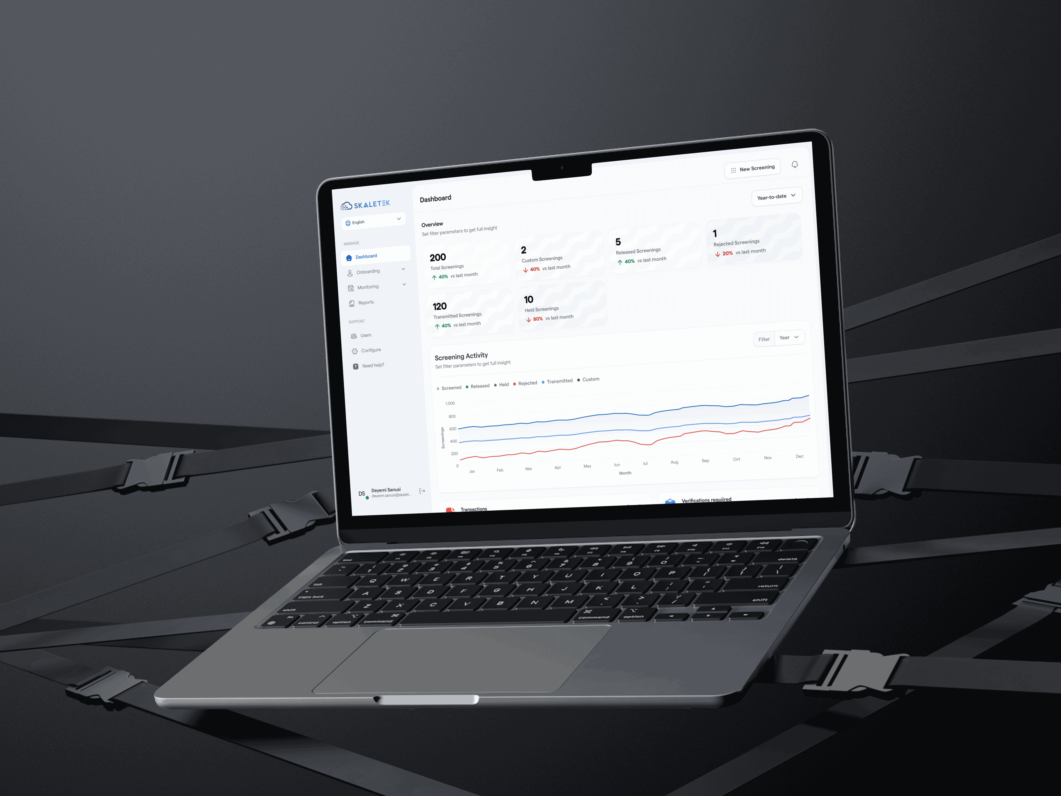
Adams AI is an intelligent financial assistant by Tyms Africa, designed to help businesses manage their finances with ease. Users can connect their bank accounts, upload statements, and allow Adams to automate and streamline financial operations from a single platform.
problem
Adams initially existed solely as a web application, which limited accessibility for business owners who needed to manage their finances on the go. This created friction for users who relied heavily on mobile devices for day-to-day operations.
solution
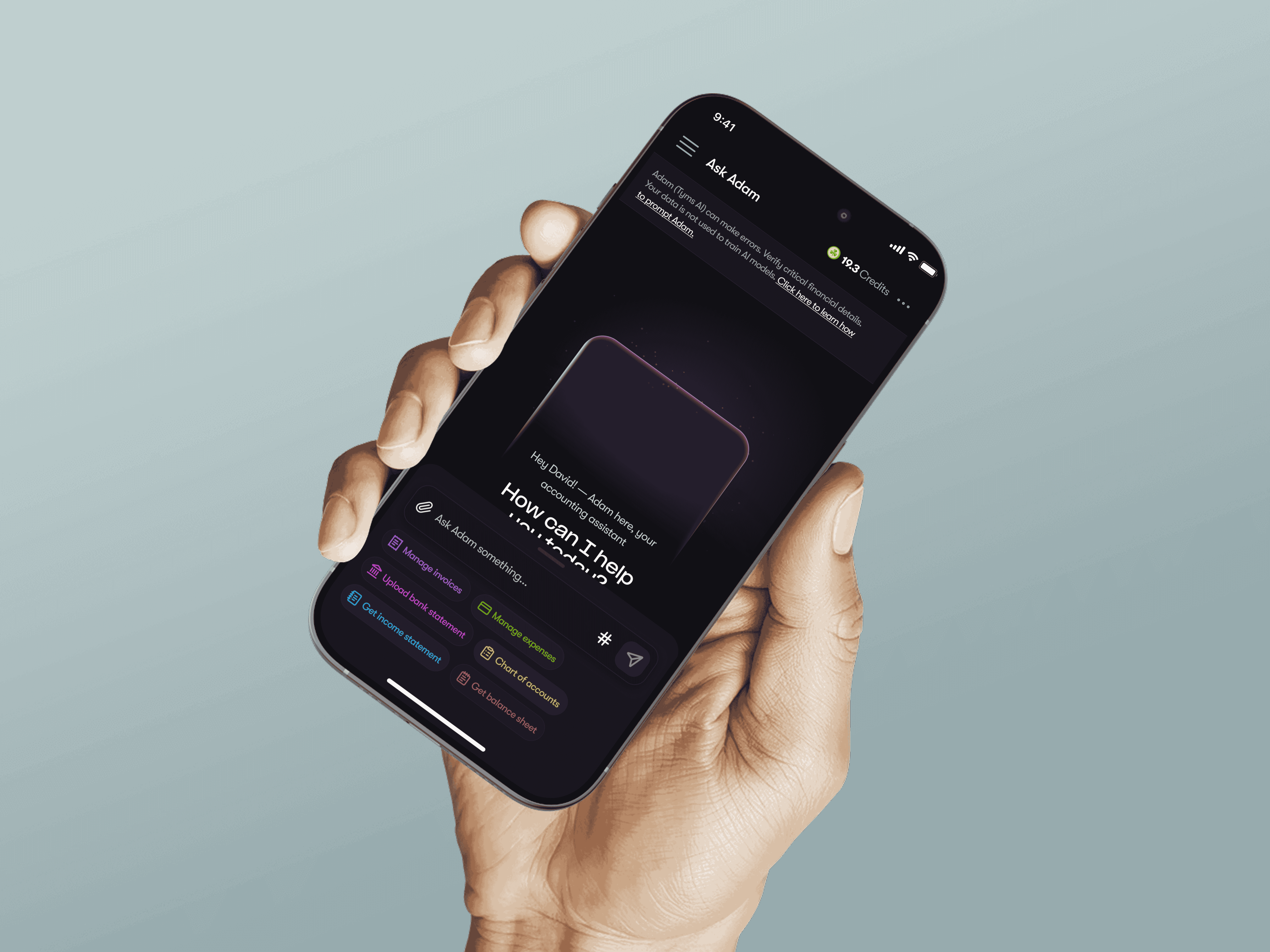
To extend Adams’ accessibility across all user types, the founders identified the need for a mobile application that delivers the same functionality and reliability as the web experience, while optimizing it for mobile usage.


Design process
Approach
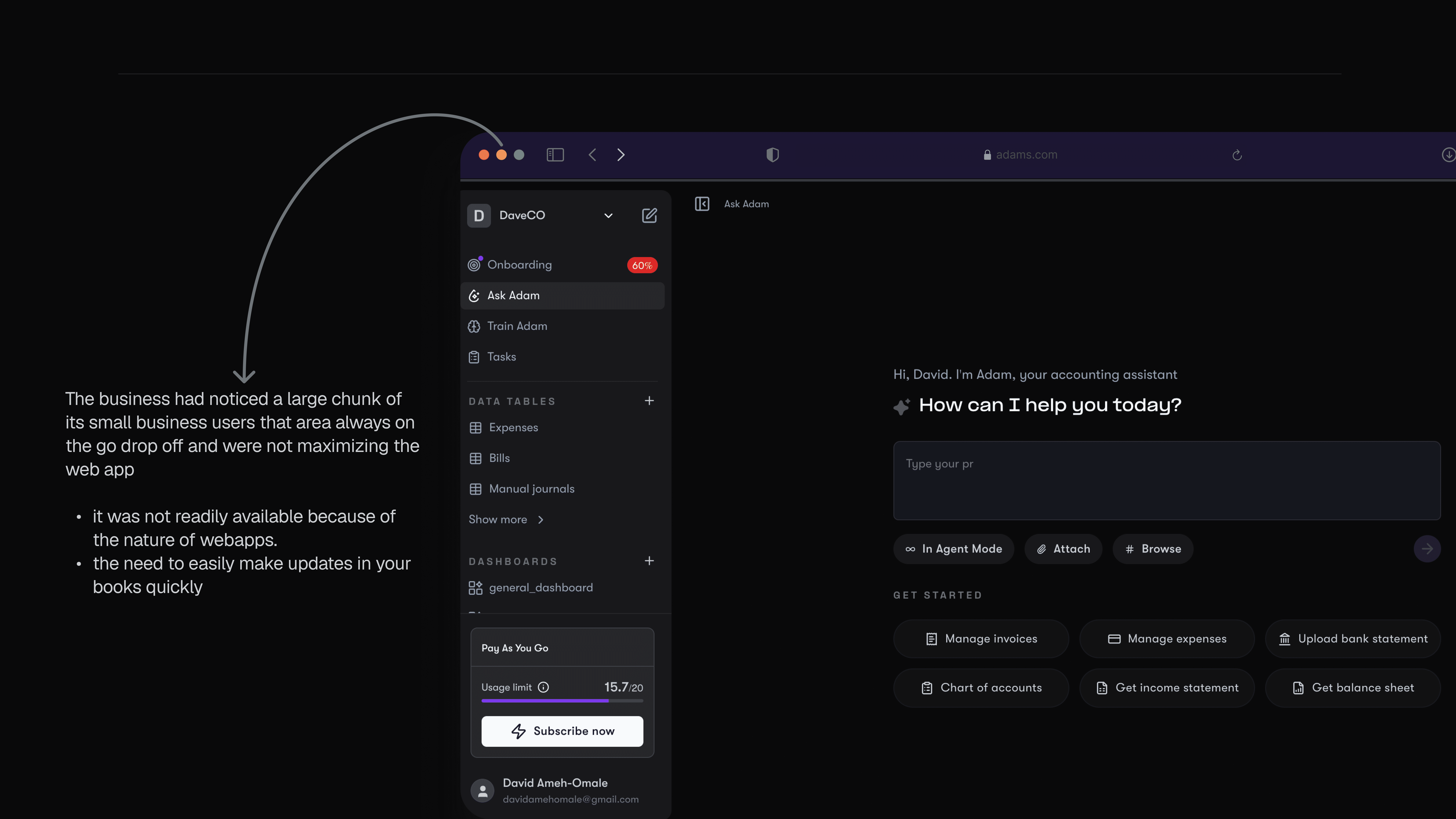
Given that Adams already had a mature web product, the focus was on translating established workflows into a mobile-first experience while adhering to standard mobile UX patterns.
Brainstorming & Exploration
A full audit of the web application’s screens and flows was conducted to understand how existing experiences would translate to mobile. Presentation quickly emerged as a critical factor, particularly because the app surfaces sensitive financial data.
To address this, I explored several industry-standard patterns for presenting financial information on mobile, including table-based views, dense list views with expandable rows, dashboard-style summaries, and card-based layouts.
Table and dense list formats were deprioritized due to reduced readability and poor scannability on smaller screens.
Dashboard summaries, while visually appealing, lacked the contextual detail required for operational decision-making.
Ultimately, card-based layouts offered the best balance between clarity, scannability, and information control. Cards were designed to surface only the most critical data upfront, with secondary details revealed progressively as users engaged further.
Key focus areas included:
Home screen functionality: Ensuring primary actions were immediately visible and easily reachable
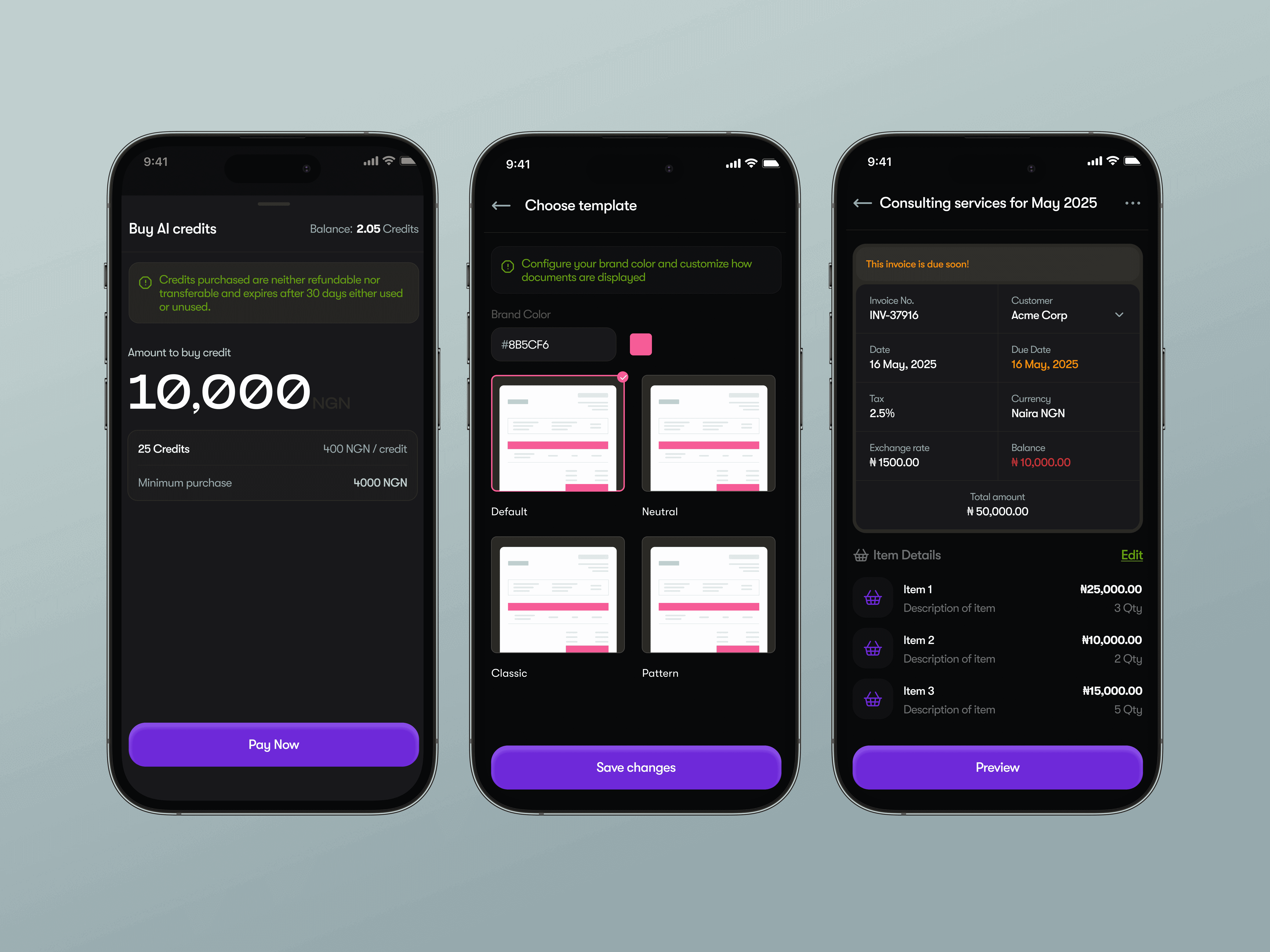
Information hierarchy: Emphasis on four core elements — title, amount, status (invoice or statement), and date
Quick actions: Optimized for effortless, one-handed access
Onboarding
Onboarding was treated as a critical moment in the user journey. To ensure users clearly understood the setup process, the onboarding flow was visually emphasized using high-contrast background colors paired with supportive iconography for each step, while maintaining accessibility standards.
Preferences & Personalization
User control and flexibility were addressed through a preferences section that allows users to:
Customize template color styles
Switch between system themes
Adjust basic app behavior to align with individual workflows
Wireframing
Low-fidelity sketches were rapidly translated into wireframes to enable fast iteration and alignment across stakeholders. Given the tight timeline (approximately two weeks), speed and clarity were essential at this stage.
High-Fidelity Design
Wireframes were refined into high-fidelity, developer-ready designs. Strong adherence to existing brand styles ensured visual consistency and a seamless experience for users transitioning between the web and mobile applications.